5 Crucial Elements of a Dynamic Web Design for Your Business
As the average small business now spends more than $75,000 a year on digital marketing, it’s clear that websites are a major factor in doing business. If you’re creating a website for the first time or redesigning your site, you need to ensure that you create something dynamic and engaging. Dynamic web design is about using the latest tools with knowledge and precision.
Here are five crucial elements to having the best site in your industry.
1. Go Mobile First
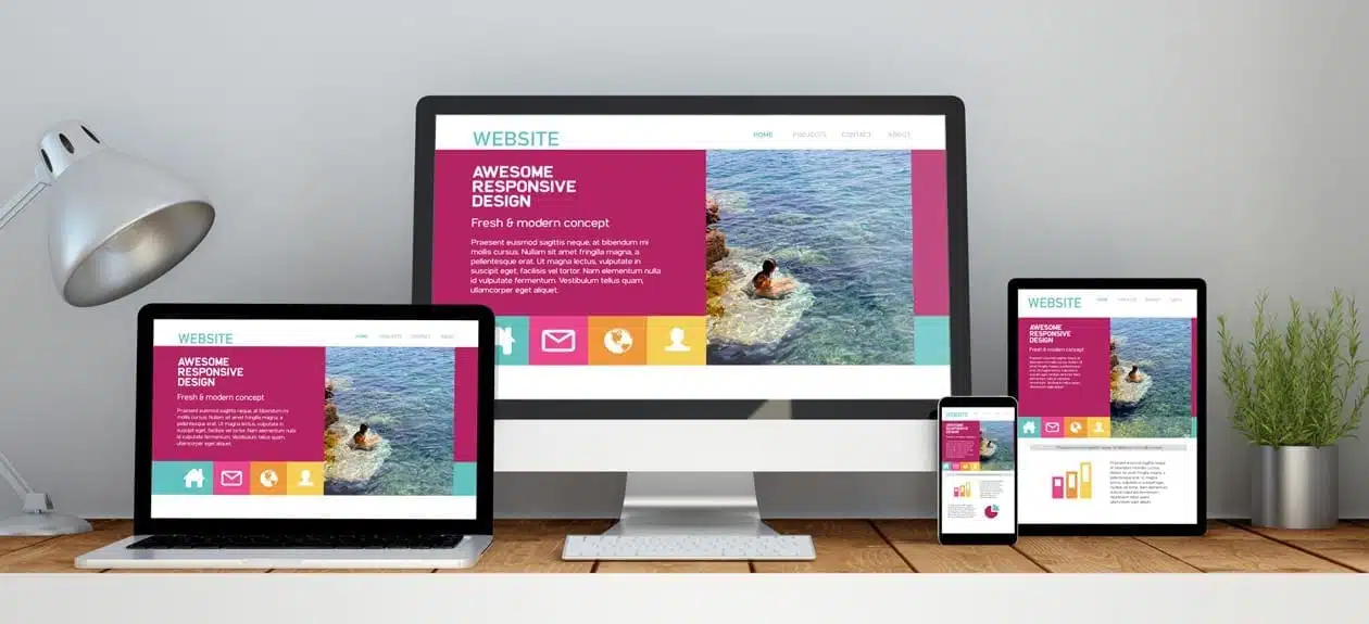
When you’re looking to have a design that’s dynamic and powerful, one of the best ways to ensure that people engage is by focusing on mobile. In the last few years, mobile-based browsing has greatly and definitively surpassed the amount of browsing done on desktops and laptops. If you want to ensure that people engage with your website, you need to meet them where they’ll be.
Mobile design is vital to be future-proof in the current digital era. The number of people who are going to access your site on a standard desktop is shrinking.
Starting with mobile also ensures that your design can scale. It’s much easier to get a site designed for mobile devices to scale to a desktop than to make it work the other way around.
Mobile design, by its very nature, is dynamic and engaging. Because people are becoming more accustomed to how apps are designed for devices, mobile browsers are following suit. Mobile browsing has changed the landscape of what websites look like, and for the better.
2. Use a Memorable Logo
One of the best ways to ensure that people engage with and, more importantly, remember your brand, is to design a powerful and memorable logo. You should have a version of your logo that can span a header and a small scale square version that works as an avatar. When people see your logo, they’ll be able to inherently recognize who you are and think of what you’re about.
Your logo needs to be unique without being too cliche or over the top. It’s possible that your logo could use visual elements that indicate what industry you’re in, but that’s not always necessary.
Apple Computers has been using a logo that has nothing to do with electronics for the last 30 years and has only seen consistent growth.
Your logo should use at least one distinct color but could also rely on neutrals like blacks and whites. When you create a memorable logo, you’ll be able to brand yourself much easier. It also lets your customers know immediately that they’re in the familiar place they’re trying to be.
3. Try a Chatbot
One of the most dynamic ways that designers have tried to make visitors feel welcome when visiting a site is with virtual assistants. Chatbots are a powerful way to engage with the customer base that’s taking the time to visit you. When customers visit your site, they’re either looking for an answer to a question or help with a problem.
Chatbots allow you to engage with customers any hour of the day. Rather than being stuck with operating hours that end at 5 PM in your timezone, you could engage with people at any hour of the day.
Link your chatbot to an answering service and you could book appointments, process sales, or troubleshoot issues any time of day. With a chatbot, you let your customers know that you’re there for them, ready to answer their most pertinent concerns.
4. Keep It Simple, Smarty
When you’re trying to create a powerful and dynamic design that your customers can engage with, your first thought might be to throw in the kitchen sink. To give your customers everything they need, you first need to prioritize their needs. Write down the real reasons that people go to your website rather than your social media profile or your Yelp review page.
When you’re looking to provide a dynamic experience on your site, you don’t need to turn your site into some unwieldy Swiss army knife. The more that you try to throw into your site, the more clunky it gets. Instead of trying to cram e-commerce, scheduling, troubleshooting, and blogging onto one site, redirect visitors to other sites.
Minimalist design is everything in the modern era. The more that you scale back your design, the easier you make your site to use. When you avoid overloading your customers with too much information, you allow them to get more out of your site.
The internet is already overloaded with junk. Your website shouldn’t be.
5. Use Profesional Photography
As more websites and social media apps cater to more visual content and fewer typed posts, images are becoming more important than ever. If you want to engage your audience with something they’ll remember, give them some professional photography.
While you might think stock photography will suffice, it’s going to be obvious when you’re not using your own images. Your audience is going to want to see high-quality images of your products and services as well as you and your team.
Hire a photographer and a few of your best clients to come in and show them using your products and services. Use those photographs for the rest of the year to advertise seasonal or special promotions. You’ll find that more people will engage with your products and services when they see high-quality images.
Dynamic Web Design is a Challenge
If you’re looking to create a dynamic web design that your customers and clients will find memorable, you need to learn the latest technology. Sites are no longer overloaded with flash, animation, and other resource-heavy elements. The trick is to scale for the device you’re working with and give them data quickly and efficiently.
If you’re looking to give your site a makeover, check out our guide for more tips.


